Saturday, 22 October 2011

Depth of field workshop

5x4 Workshop was really fun, but found the task a challenge as I had never worked with a Horseman 5x4 large format camera. We also used black and white and  colour film. To start our induction we started off by observing some photographers.
I really enjoyed researching this image. The photo emphasizes a shallow depth of field and was shot with a 10x8 deardorff wooden plate camera. I found this hard to believe, as we were using a 5x4 large format camera, which I thought was big enough. The deardorff camera, is a large format, and produces polirad prints. When looking at the Photo you can see how the edge of the image is diffused and only the eyes are in focus.


Furthering our research we were introduced to the photographer Peter Fraser. The image we looked at was created using a  plaubel makina camera. This medium format camera was first released in 1931, and was the first model with the shutter speed ring placed around the lens. during the middle of the 1970's, the unique strut camera was succeeded by a Japanese New Makina 6x7, first was first  shown on an exhibition in 1977 and appeared in 1982 . As I hadn't heard of this camera, I researched into the model, and found the background history very interesting and helpful for future references.


Philip Lorca Dicorcia, the American photographer was another artist we observed . I enjoyed researching him, as I loved how he used frames to draw the attention towards the subject. His style involved informal snapshots and iconic quality staged compositions, making awareness of the psychology and emotion contained in real-life situations. He would capture everyday occurrences beyond the realm of banality, and his work is described as documentary photography mixed with the fictional world of cinema and advertising, which creates a powerful link between reality, fantasy and desire. I think his photographs give a sense of heightened drama and enjoy how he creates accidental poses, unintended movements and insignificant facial expressions. When focussing on the body unit, I will defiantly research this artist further, and experiment with a similar style.


Other photographers we explored where David Bate, Gregory Crewdson and Thomas Struth. When researching these photographers you realise noting looks distorted in their photographs. 


Gregory Crewdson
 When looking at Gregory Crewdson`s pictures, I noticed a lot of his work is featured as disturbing, and captures surreal events. Some of his little stories were not even about the photographs, instead they were about the people, places and processes.
 
My favourite series of work he has produced is `beneath the roses` as I love the cinematic lighting. I also admire how he uses long shots, and how instead of focusing on the people themselves, he emphasizes the importance of the ambience around the people. His style is seen as dramatic and cinematic, and his photographs are shot using a large crew, and are elaborately staged and lighted.
 
 
Crewdson’s work is controversial in the photo community; his photos are each elaborately staged, the complexity and scale of which can rival small-budget films.


I see a lot of Edward Hopper in Crewdson’s work.  I think many, many photographers are influenced by Hopper simply for the fact that the man understood light, and light is the most influencing element in any photograph.  Crewdson’s images are constructed with meticulous attention to how light affects the scene: which objects it illuminates at what angle, how it can back-light fog or mist, how it reflects off of wet or shiny surfaces- not to mention which areas in the frame are not lit- as well as numerous other aspects.


David Bate is a London based visual artist and critical theorist, known particularly for his work on photography. He photographs domestic objects accidentally broken by him, Bate elevates these things from the humble still life to extravagant dramas of lost memories and enjoyment of the emotions involved in a broken object.


Thomas Struth is a German photographer whose wide-ranging work includes depictions of detailed cityscapes, Asian jungles and family portraits. He is one of Germany's most widely exhibited and collected fine art photographers.


Quote
"has a clear language, one that speaks openly not only about its subjects ... but also very much about the attitude of the photographer toward these things. In this regard, a photograph is always objective."
 
from researching all photographers, if you use a pale background the subject will be emphasized. I will keep this in mind when making some test shots.
 
Depth of field useful information


Perspective workshop

Perspective workshop was interesting. I preferred this workshop than the others, as I felt I had learnt valuable information form previous workshops etc: setting up studio equipment, setting up lighting equipment.


When taking my shots I took 2 photographs on 5x4 with the horeman, 1 colour & 1 black & white - Portra 160.
 
First we concentrated on using 2 objects, we had to photograph one behind the other twice, with 2 different lenses. At first everything was set to 0, but then we had to shift the perspective. we then experimented with all the different adjustments on the camera. First we played with the `belo`, this made the object look straight. then we used the `tilt`, this made the part of the image in sharp  focus. The shift allowed us to move the front of the camera left or right, the movement is similar to rise and fall but moves the image horizontally rather than vertically. The rise and fall were a very important feature as the rise helped change the portion of the image that was captured on the film.
I learnt from our induction talk, if we had any form of distortion, a wide angle lens would be useful to have, as this would get more of the subject in the photo.


Lens research
 
As I was unsure about different sizes of lens I did some research to learn mor einformation. The image below shows a relatively wide focal length of a 28mm lens. The following image shows 4 trees with an equal distance between them. At the wide setting it seemed that the distance increased dramatically towards the foreground. In other words: the tree to the left seems to be separated from the rest of the trees. Therefore the background seems to be far in the distance.


The next picture has a more natural view at using a 50mm lens. The perspective is much less extreme. Due to our real life experience, we can guess the distance between the trees is roughly the same, though the separation is still visible.


This image shows a 100mm lens. The trees are quite close together, showing a small distance between one another. Compared to the previous sample, you notice the enlarged background moves towards the main object. The scene now looks compressed.


Using a 200mm lens,  the effect increases even more. The group of trees seem to appear on the same distance plane. The background is blurred, due to the small depth-of-field but the image seems to look a few meters away. This is called a "flat" perspective.


perspective helpful information 


colour printing workshop

Really enjoyed the colour printing induction on the 7th of October. The procedure was exciting and enjoyable but at the same time challenging as the task involved a great amount of attention to detail. Throughout the process I enjoyed and was intrigued learning about the subtractive system. The subtractive system allows us to work with the colours named Yellow Magenta and Cyan. the two systems are known as the combing of colours. When applying this procedure there is the combination of three basic colours. for instance if I was to add red and blue together in equal amounts I will get Magenta a purple colour. By varying the amounts of red and blue I would get all the colours that exist in in the spectrum between red and blue. The same with the combination of blue and green and green and red. I found this task hard at first as I had to apply several amount of test strips to achieve a well balanced coloured image. At first I test striped:


1                                                                
Y:80
M:50
B:0
0.5 seconds 
2
Y:80
M:50
B:0
1.7 seconds 
3
Y:80
M:60
B:0
17 seconds
4
Y:75
M:55
B:0
17 seconds
5
Y:75
M:57
B: 0
17 seconds
6
Y: 75
M:53
B:0
17 seconds
 
 
 I hope to apply some more test strips throughout my project, as I can gain more confidenceand skills intitled for this area of work .
This picture shows the enlarger. When having our induction I learnt that this type of enlarger is a bit different than the black and white enlarger. On the colour enlarger there is a colour head above the negative carrier. This colour head has three filters in it, which were known as the subtractive system.


This shows the colour guide which was placed above the printing machine. I found this guide very helpful as I could guide my prints towards my final outcome.


This is my final print,  I was pleased with the outcome, as I felt I had achieved a new skill, learning information in all areas. Although the process took a long time, I think the colours are well balanced.


Tuesday, 18 October 2011

Deforestation idea


The photographer Jan Staller has produced several projects that have inspired me. Most of her work focuses on the impact of man and the mess it leaves behind. Her images are seen as close –up, as she wants to create an abstract approach, this entitles the public to focus on the colour and texture of her subjects. I wanted to try and create a similar approach emphasizing colour and texture, throughout my test shots of deforestation.


 I also gained much inspiration from Robert Glenn Ketchum's work. I was fascinated on how he cropped his images to block out the backgrounds of his subjects. This reduced the sense of scale and made the public focus on textures and vibrant colours. His depiction of the natural landscape is relatively stunning, and works with the 'great outdoors‘.


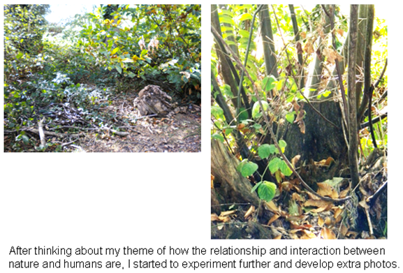
humans have changed the environment. Lat week I began taking some test digital photos of deforestation. This evidence of woodland and trees highlighted the sensitive subject of our human power and control and need for material.